SortedTableInHtmlTable
The SortedTableInHtmlTable component renders the contents of a single sorted Table in a Store, as an HTML <table> element, and registers a listener so that any changes to that result will cause a re-render.
SortedTableInHtmlTable(props: (
  SortedTableInHtmlTableProps &
  HtmlTableProps
)): ComponentReturnType| Type | Description | |
|---|---|---|
props | ( SortedTableInHtmlTableProps & HtmlTableProps ) | The props for this component. |
| returns | ComponentReturnType | A rendering of the |
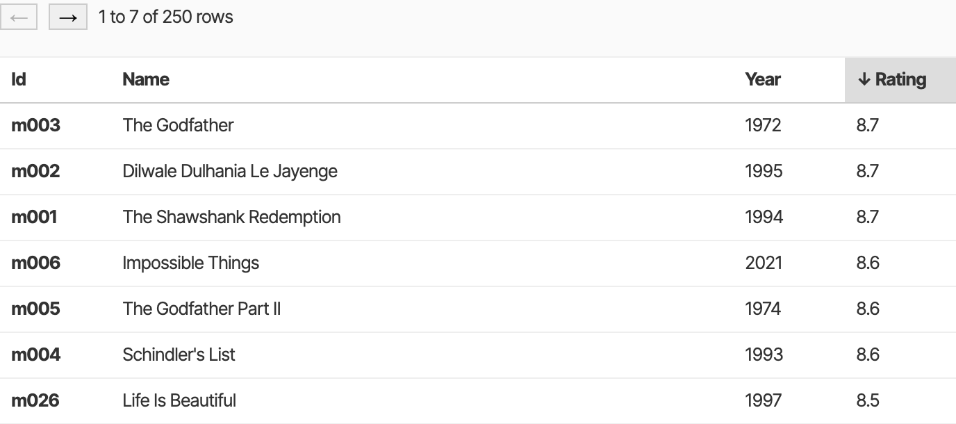
See the <SortedTableInHtmlTable /> (React) demo for this component in action:

The component's props identify which Table to render based on Table Id, and Store (which is either the default context Store, a named context Store, or by explicit reference). It also takes a Cell Id to sort by and a boolean to indicate that the sorting should be in descending order. The offset and limit props are used to paginate results, but default to 0 and undefined to return all available Row Ids if not specified.
This component renders a ResultTable by iterating over its Row objects, in the order dictated by the sort parameters. By default the Cells are in turn rendered with the CellView component, but you can override this behavior by providing a component for each Cell in the customCells prop. You can pass additional props to that custom component with the getComponentProps callback. See the CustomCell type for more details.
This component uses the useSortedRowIds hook under the covers, which means that any changes to the structure or sorting of the Table will cause a re-render.
You can use the headerRow and idColumn props to control whether the Ids appear in a <th> element at the top of the table, and the start of each row.
The sortOnClick prop makes the table's sorting interactive such that the user can click on a column heading to sort by that column. The style classes sorted and ascending (or descending) are added so that you can provide hints to the user how the sorting is being applied.
Provide a paginator component for the Table with the paginator prop. Set to true to use the default SortedTablePaginator, or provide your own component that accepts SortedTablePaginatorProps.
Finally, the onChange prop lets you listen to a user's changes to the Table's sorting or pagination.
Examples
This example creates a Provider context into which a default Store is provided. The SortedTableInHtmlTable component within it then renders the Table in a <table> element with a CSS class.
import React from 'react';
import {createRoot} from 'react-dom/client';
import {createStore} from 'tinybase';
import {Provider} from 'tinybase/ui-react';
import {SortedTableInHtmlTable} from 'tinybase/ui-react-dom';

const App = ({store}) => (
  <Provider store={store}>
    <Pane />
  </Provider>
);
const Pane = () => (
  <SortedTableInHtmlTable
    tableId="pets"
    cellId="species"
    className="table"
  />
);

const store = createStore().setTables({
  pets: {
    fido: {species: 'dog'},
    felix: {species: 'cat'},
  },
});
const app = document.createElement('div');
createRoot(app).render(<App store={store} />);
console.log(app.innerHTML);
// ->
`
<table class="table">
  <thead>
    <tr>
      <th>Id</th>
      <th class="sorted ascending">↑ species</th>
    </tr>
  </thead>
  <tbody>
    <tr>
      <th title="felix">felix</th>
      <td>cat</td>
    </tr>
    <tr>
      <th title="fido">fido</th>
      <td>dog</td>
    </tr>
  </tbody>
</table>
`;
This example creates a Provider context into which a default Store is provided. The SortedTableInHtmlTable component within it then renders the Table with a custom component and a custom props callback for the species Cell. The header row at the top of the table and the Id column at the start of each row is removed.
import React from 'react';
import {createRoot} from 'react-dom/client';
import {createStore} from 'tinybase';
import {CellView, Provider} from 'tinybase/ui-react';
import {SortedTableInHtmlTable} from 'tinybase/ui-react-dom';

const App = ({store}) => (
  <Provider store={store}>
    <Pane />
  </Provider>
);

const Pane = () => (
  <SortedTableInHtmlTable
    tableId="pets"
    cellId="species"
    customCells={customCells}
    headerRow={false}
    idColumn={false}
  />
);

const FormattedCellView = ({tableId, rowId, cellId, bold}) => (
  <>
    {bold ? <b>{rowId}</b> : rowId}:
    <CellView tableId={tableId} rowId={rowId} cellId={cellId} />
  </>
);
const customCells = {
  species: {
    component: FormattedCellView,
    getComponentProps: (rowId) => ({bold: rowId == 'fido'}),
  },
};

const store = createStore().setTables({
  pets: {
    fido: {species: 'dog'},
    felix: {species: 'cat'},
  },
});
const app = document.createElement('div');
createRoot(app).render(<App store={store} />);
console.log(app.innerHTML);
// ->
`
<table>
  <tbody>
    <tr>
      <td>felix:cat</td>
    </tr>
    <tr>
      <td><b>fido</b>:dog</td>
    </tr>
  </tbody>
</table>
`;
Since
v4.1.0